Instagram
Brand Refresh
View Live Site︎︎︎
View Sizzle Reel︎︎︎
Role—
Associate Digital Designer
Activities—
Visual design, Brand development, Interaction design, Design system, Motion storyboarding, Led client workshop sessions and Visual Quality Assurance testing for the website
Intro—
Instagram has become one of the most iconic brands of our time. It is where culture is made and pushed forward. It was time the brand was a reflection of that. A new typeface, updated gradient and color palette, and refined approach to layout celebrates the global community of creators on their platform.
Focusing on these key elements of the brand identity, we partnered with the Instagram brand team to create a highly expressive digital experience that conveyed the essence of the brand in a fun and interactive way.
My team and I designed a bespoke microsite experience focusing on these key elements of the brand identity. Starting with a dynamic homepage to introduce each key element through their respective pages for Type, Layout, and Gradient page. I concepted and designed detail oriented content that follow brand guidelines showcasing the core brand elements. This content lives on the website and sizzle reel. I led a small team of motion designers to create content across the website that celebrates the tone and voice of Instagram.
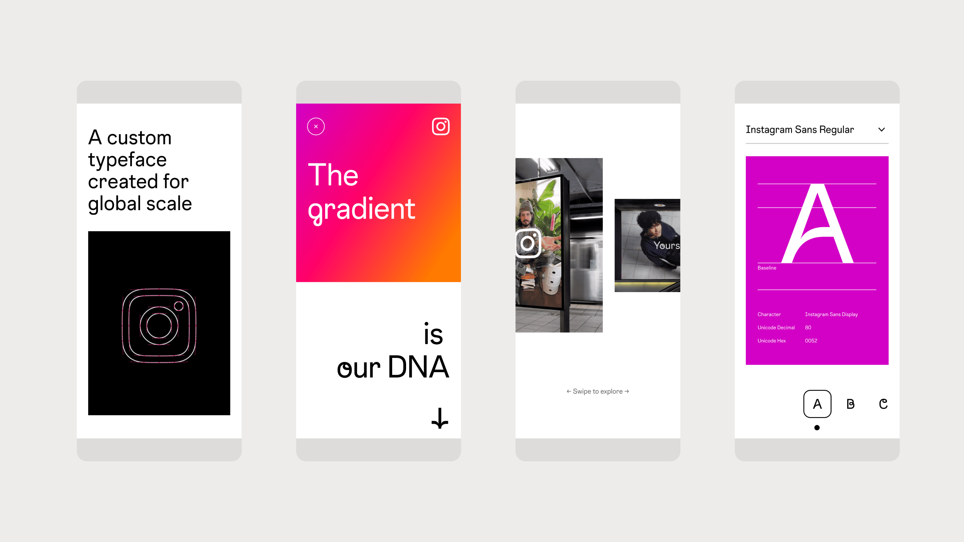
The brand refresh introduces a new illuminated gradient, and a logo inspired by the new brand typeface, Instagram Sans. IG embraces the soft rounded corners in the glyph “squircle”.
Through the years, Instagram has evolved to have a global recognition. It is identified by its glyph- the camera set in the iconic gradient. The hero moment above is designed to capture the audience and showcase the transition of the infamous glyph.
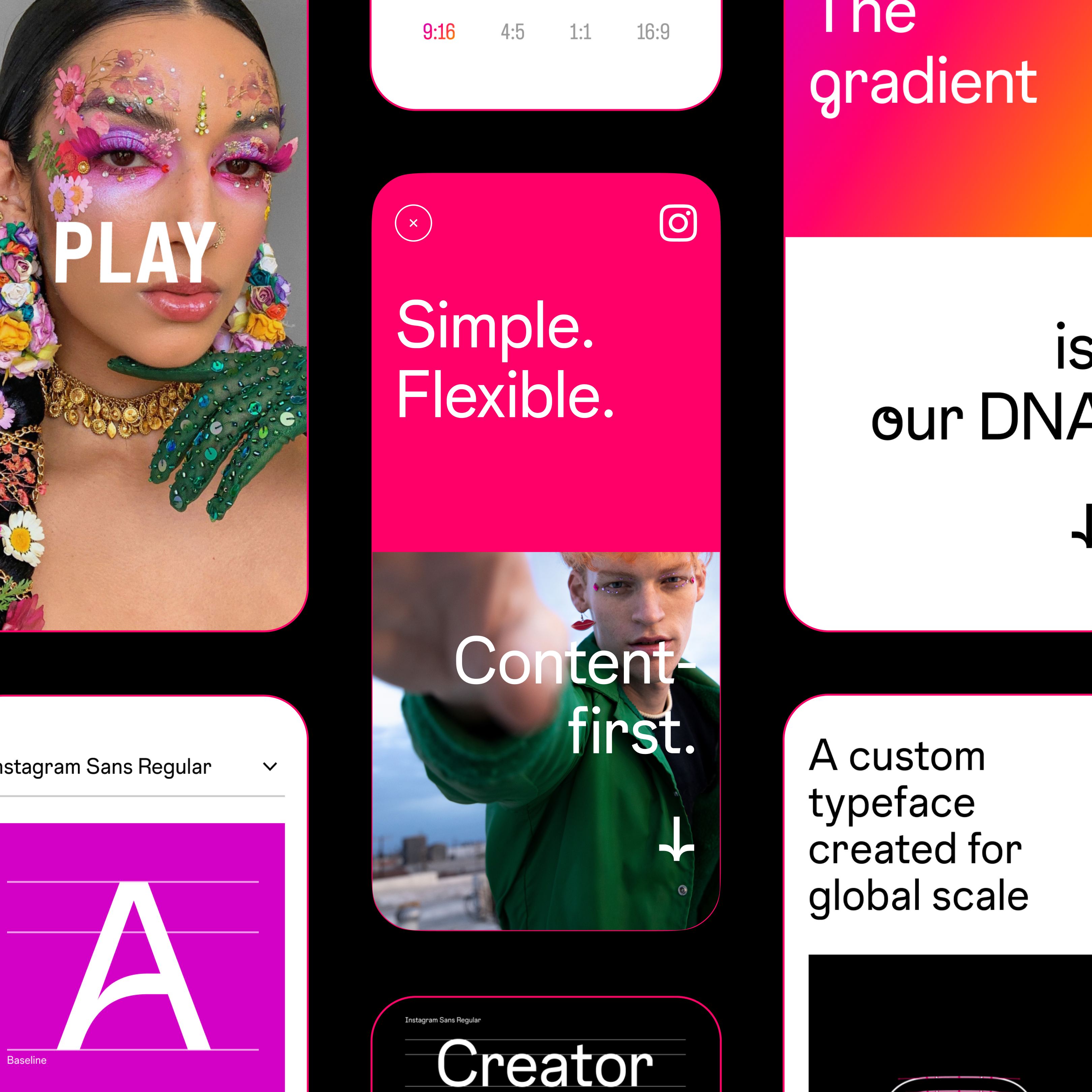
The layout deep dive card above represents the new dynamic grid system in correlation with type, glyph, and imagery. Again, it puts the brand system at the forefront.
The homepage features three deep-dive moments for the core brand elements. We created dynamic hover states that previewed what was to come. In addition, we used creator imagery that highlights the IG community.
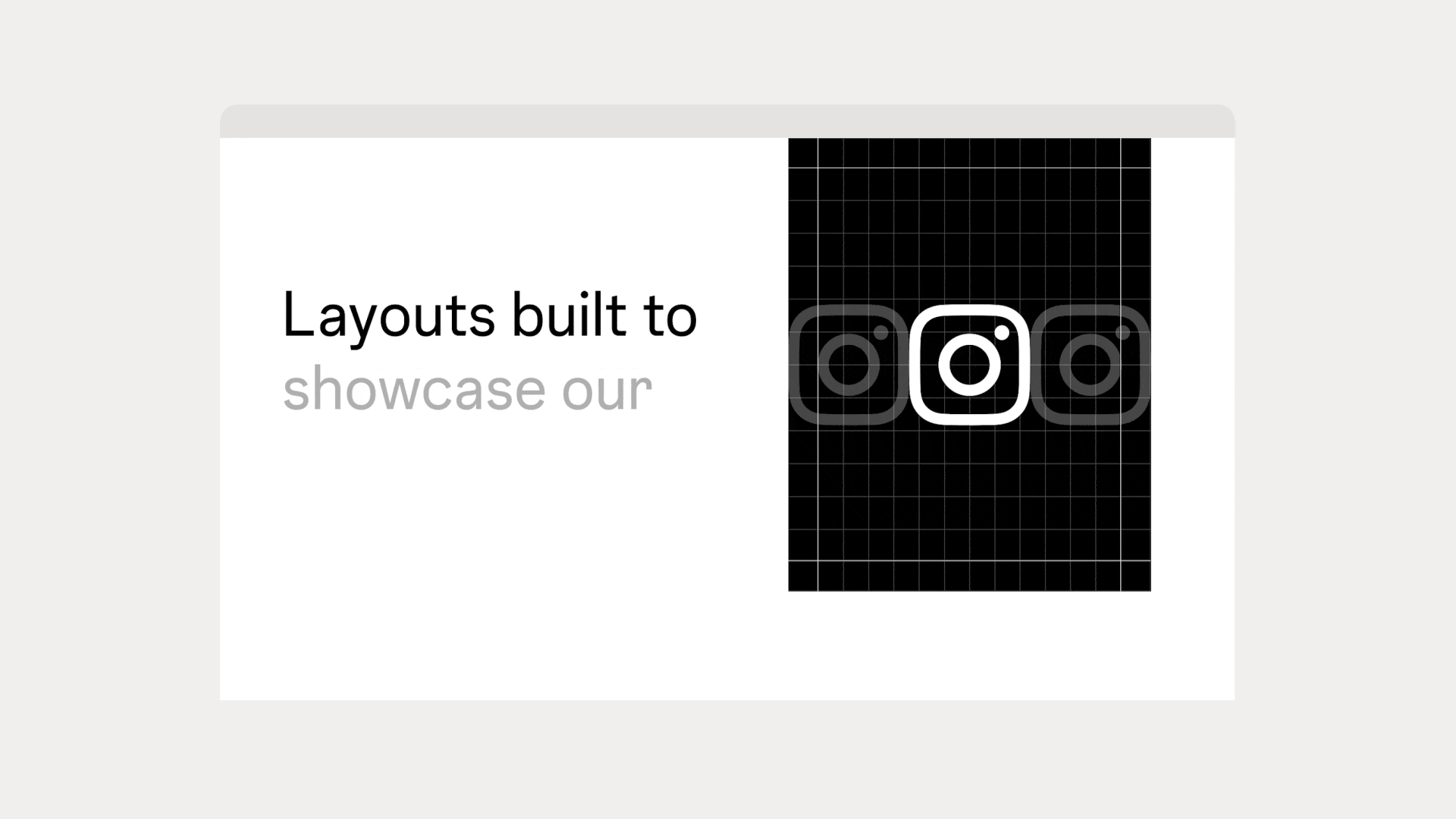
We created a cursor enabled interactive Gallery module on every landing page to showcase brand assets.
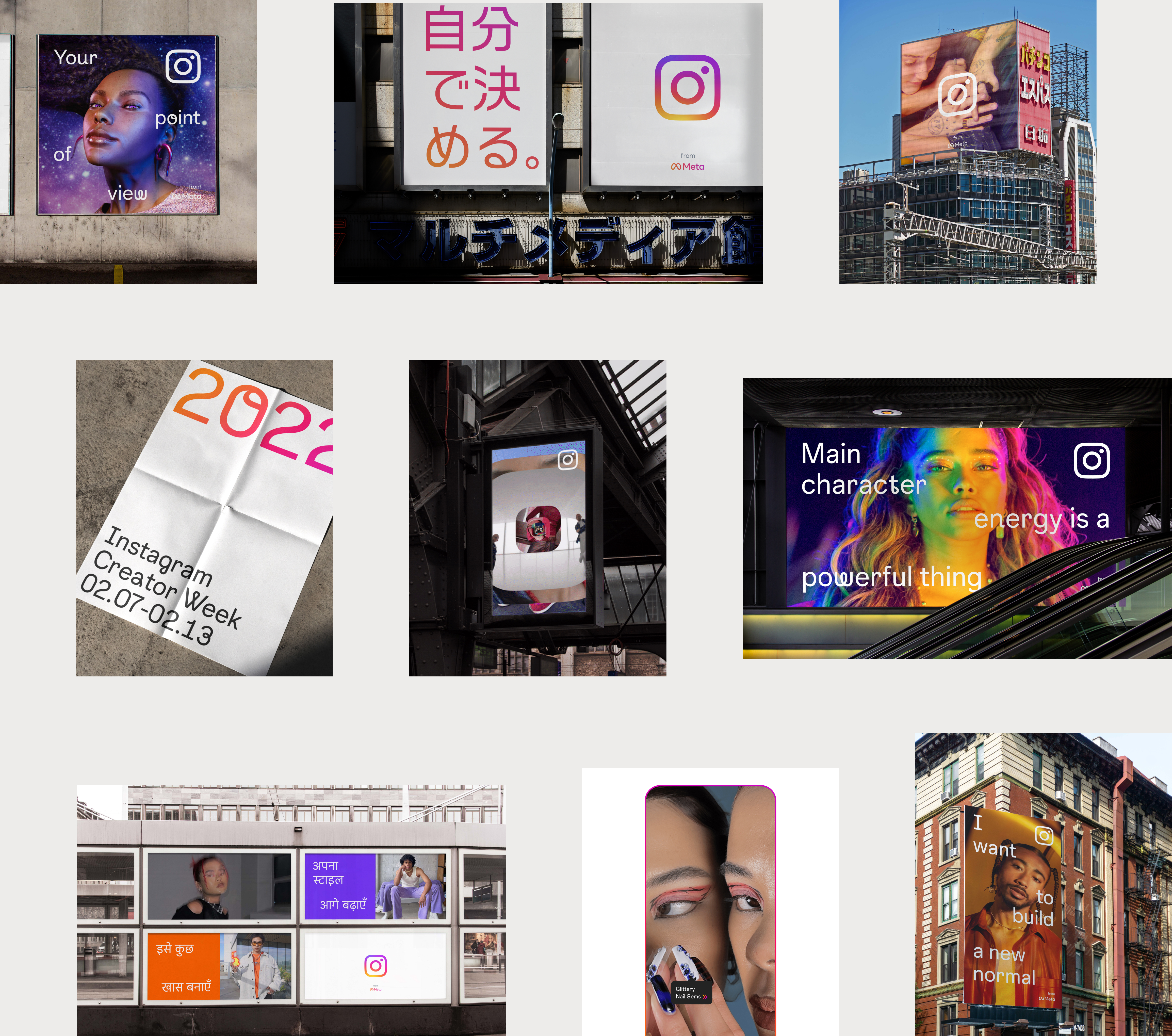
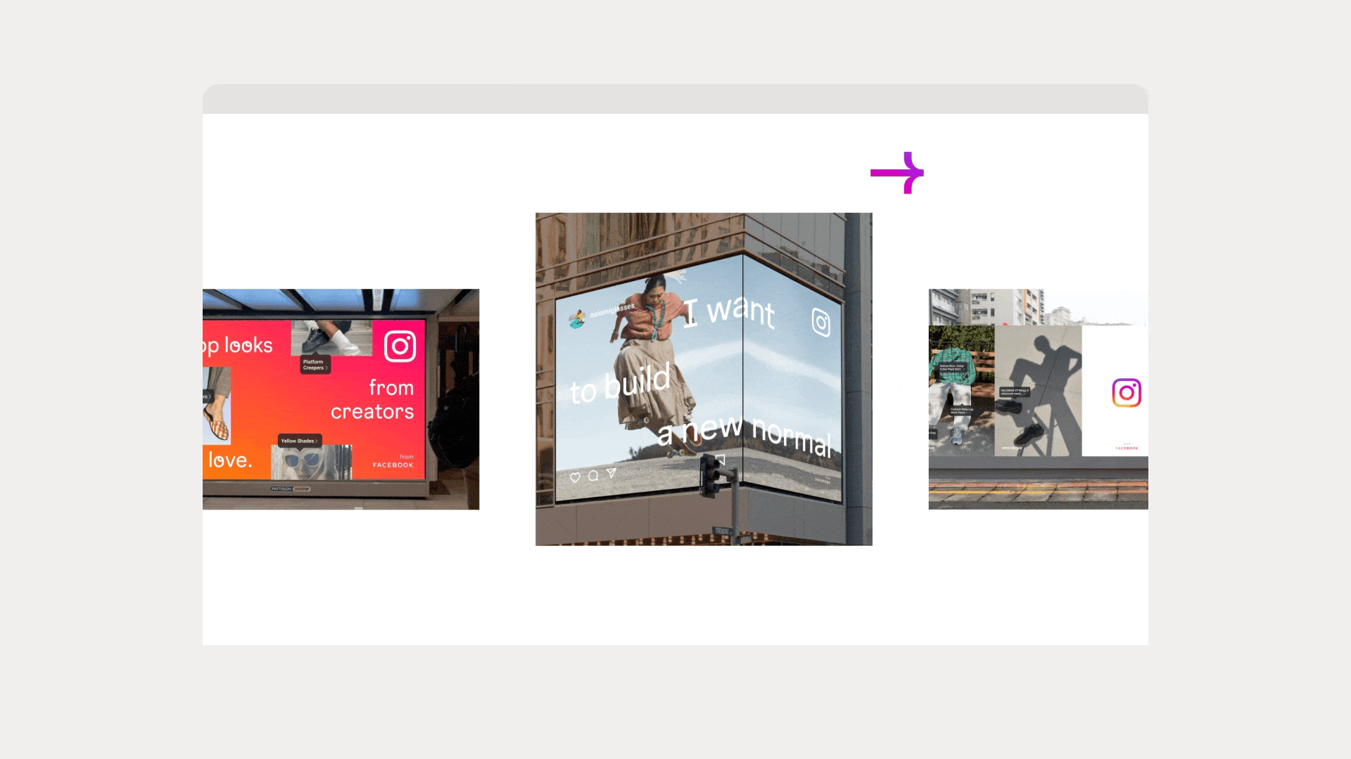
I designed tons of OOH advertising- static and motion that elaborated on Instagram’s brand system across various mediums, whether that be highlighting Instagram business, Creator Labs, and several other campaigns.
Through the assets in the gallery module, my goal was to emphasize the details of their new typeface and playfulness of the brand.
Instagram Sans was designed with accessibility and global scripts at the core. Hence, I concepted and designed the assets to highlight these multiple global scripts that IG offers through their product including Korean, Kannada, and Arabic.
In contrast, the animation tone stays true to the brand. The motion technique is an extension of their product UI with a looping, humanistic style.
On the Type deep dive page, we created various interactive modules including Type Setter, Character Selector and Single asset gallery for the audience to engage with Instagram Sans.
Use the interactive Type Setter to type your own message, choose between various font styles, alignment, and color schemes. Also, engage with some hover cursor interaction on the Single asset gallery module to see Instagram Sans at play in a large scale setting.
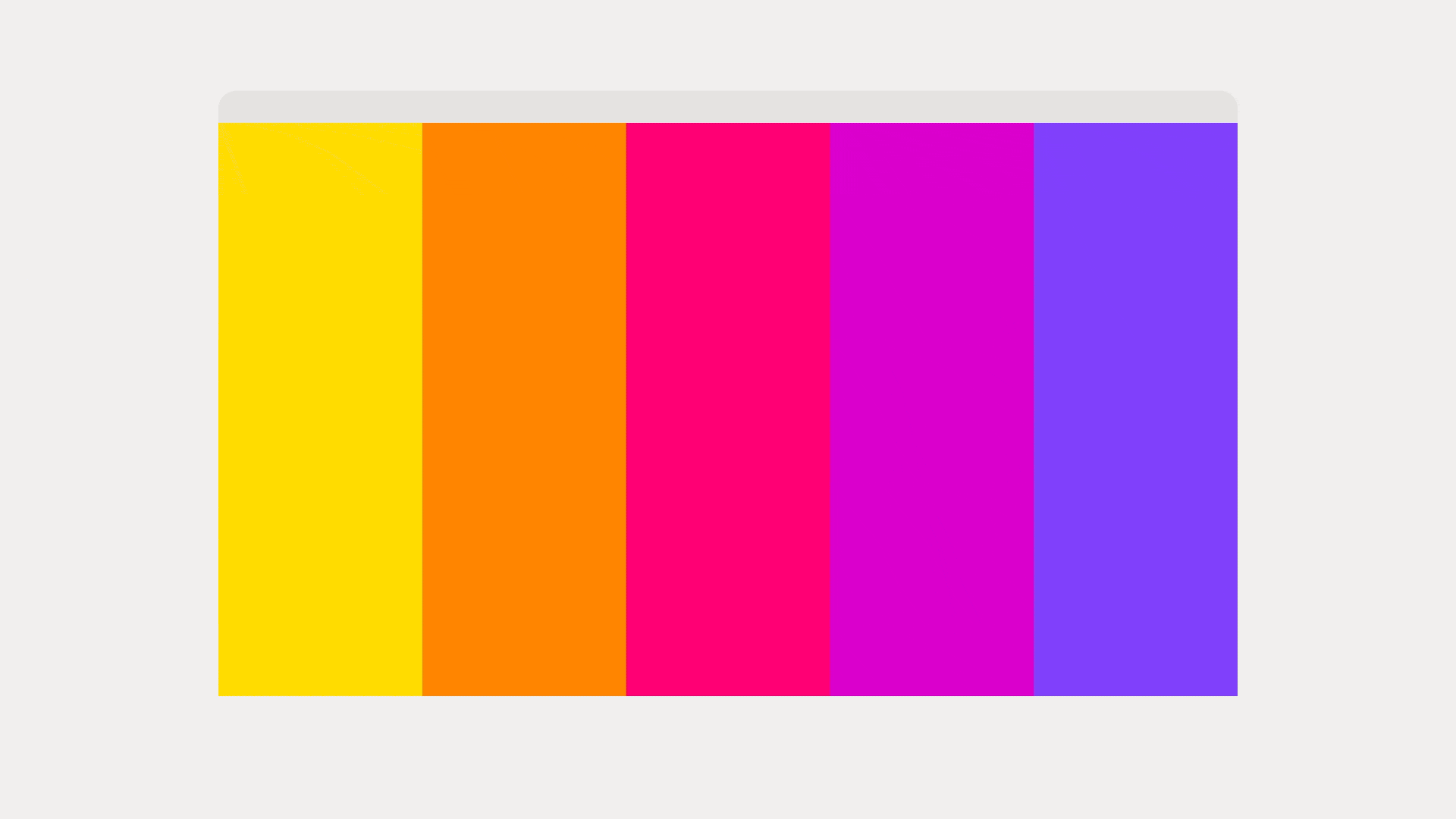
On the Gradient deep dive page, we created two additional interactive modules including Color Selector, and Gradient Picker.
We created a dynamic Color Selector module that allows users to interact with the elements in a delightful way. It is a moment to showcase IG brand colors in application with other core elements like typography and layout.
Initially, the Gradient Picker module is set to a default value of five color varient.
The interactive module lets the audience to engage with three color combos from IG brand guidelines.
From left to right- Static mobile designs for Type Deep Dive card on the homepage, Hero module from gradient deep dive page, OOH Gallery module on the homepage, and Character Selector module on the type deep dive page.
Type moves freely across the dynamic grid to invite brand exploration.
I conceptualized, designed and collaborated with motion designers to highlight Instagram's adaptive grid. We bring focus on the flexible nature of the grid and purposefully transform it to different aspect ratios of 9:16, 4:5, 1:1, & 16:9.